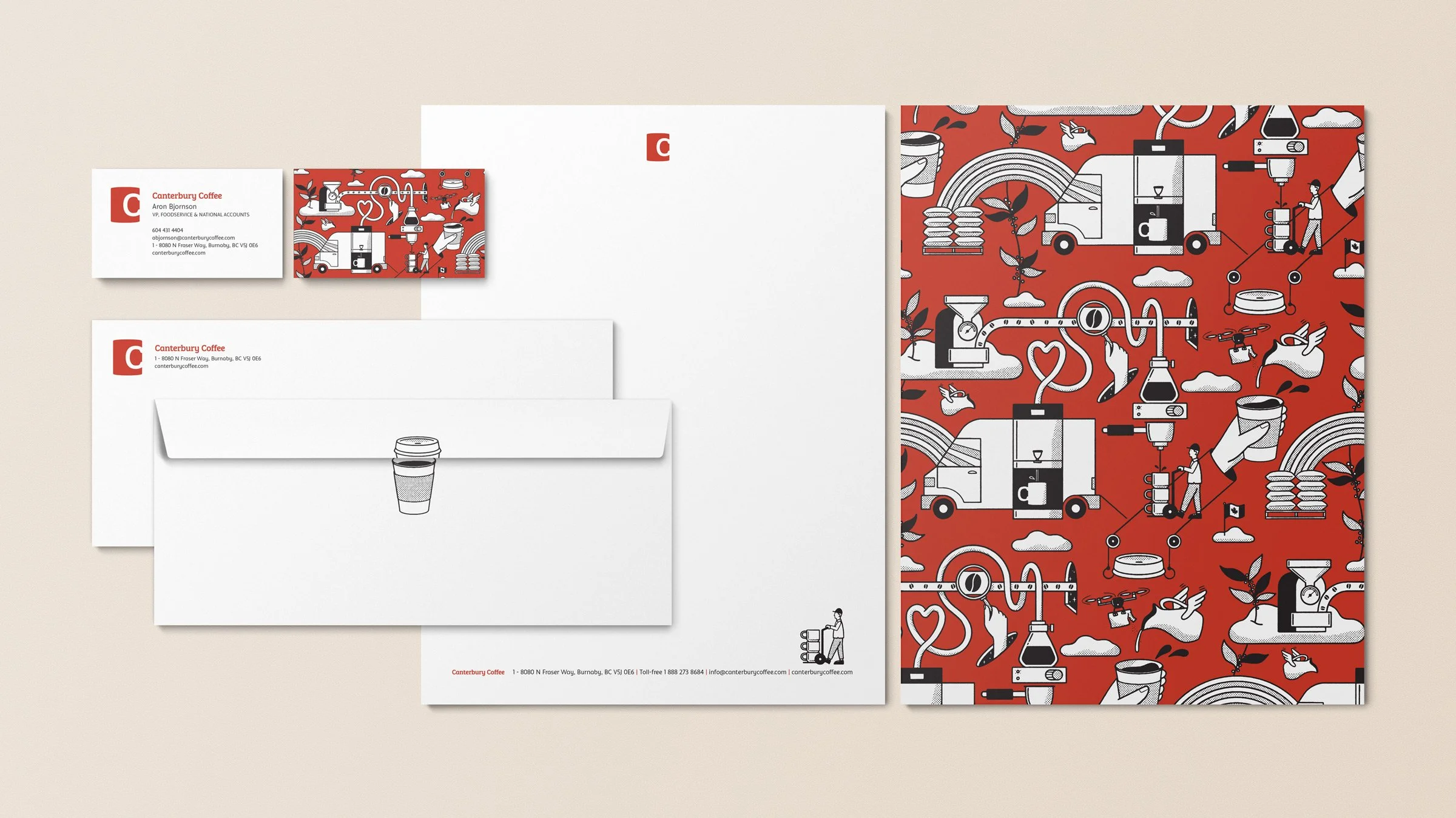
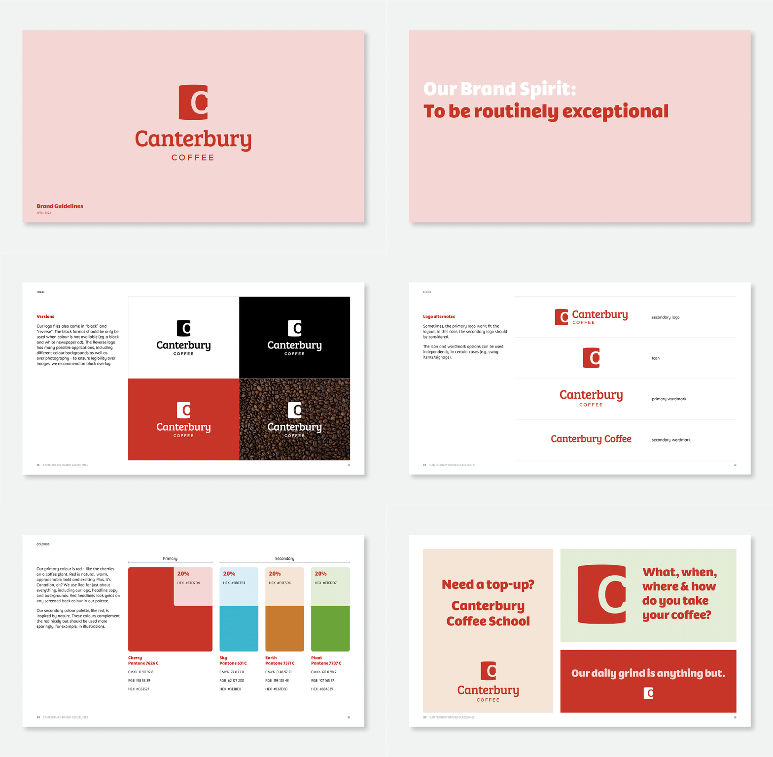
As we all know, good coffee in a favourite mug gives a warm and comfortable feeling. And Canterbury sells good coffee products with warm customer service. So naturally, the new logo is based on a typographic C made from the warm, and iconic handle of a coffee mug.
The warmth was carried through into the wordmark, with bespoke typography.
Role: Creative Director, Lead Designer, Illustrator
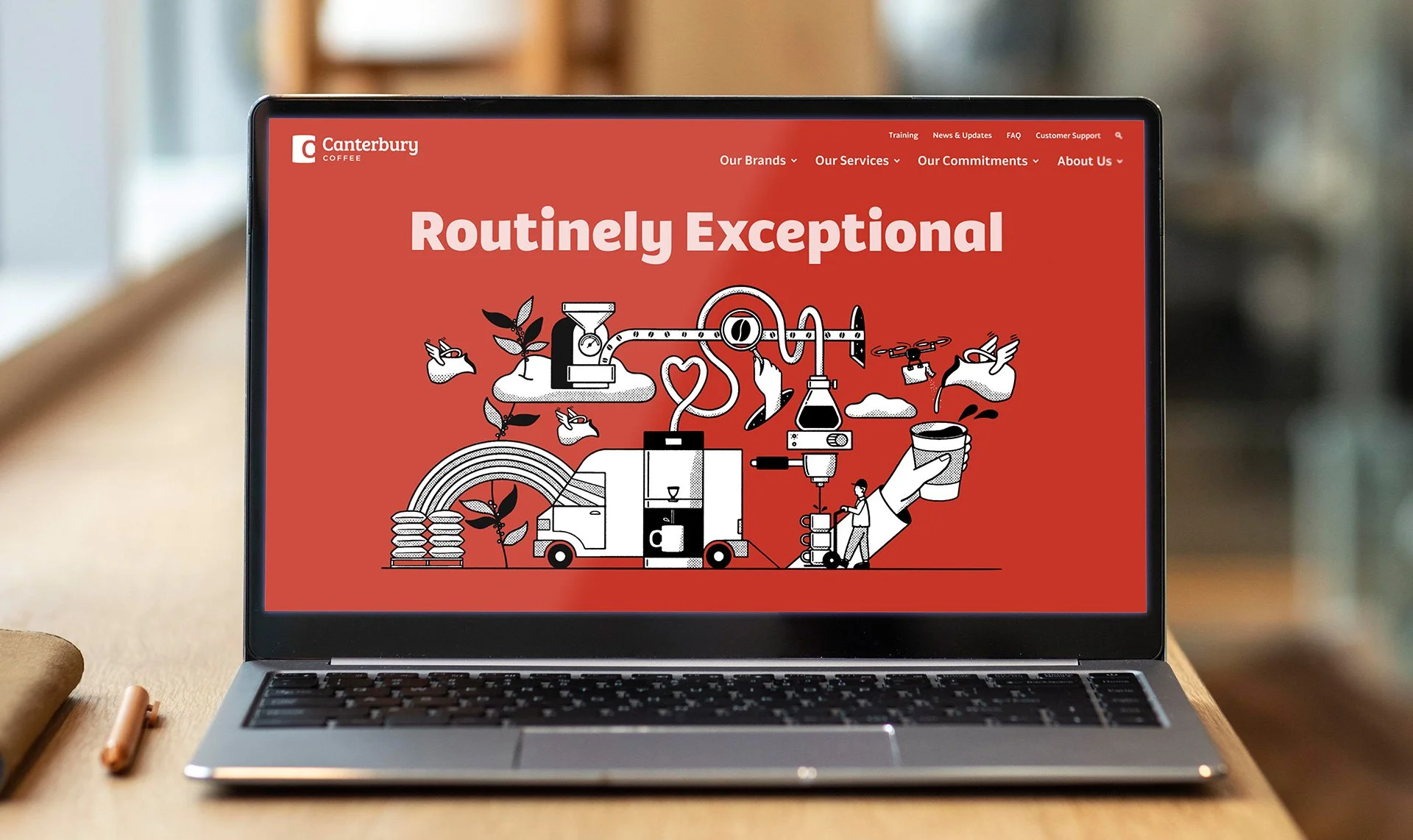
From there, the identity system followed suit with human-centric illustrations, cozy web icons, personable photography and warmer writing.
